
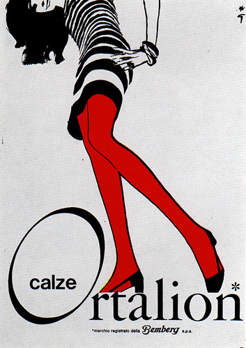
This poster from the 1960s uses gestalt principles in a variety of ways. One way is the idea of continuance. The eye is drawn towards the leg because of its color and positioning. From this the idea of movement with feet positioned at an angle causes the eye to draw down the leg, towards the feet, and thus right to the company name. Another gestalt principle is the idea of proximity, with the feet in close proximity to the company name and the "calze" in close proximity (inside the O) to the other part of the company name (Ortalion). The last principle is the idea of closure. At the bottom of the poster is the company name along with other important information. This puts these names in the observers mind last and also acts to group the writing together, causing as little interference with the visual as possible.
I agree. This poster is a wonderful example of gestalt principle. It is very simple and yet draws the reader in very effectively. The red contrast against the gray stands out extremely well, and leads the reader's eyes right to the name.
ReplyDelete-Jim Walsh
this is exactly what i think of when i think of a really easy and effective way of using gestalt principles. its so simple but the red and her long legs are such an eye catcher any viewer would be drawn to it
ReplyDeleteThis is a very effective poster. I definitely think that they effectively used her legs to draw the readers attention to the writing. I also see that the only color on this poster are her legs. The fact that the color leads to the words shows that the designer wanted to really highlight the wordmark.
ReplyDelete